


Customise the rewards dashboard
Simple Points and RewardsUpdated October 26, 2026
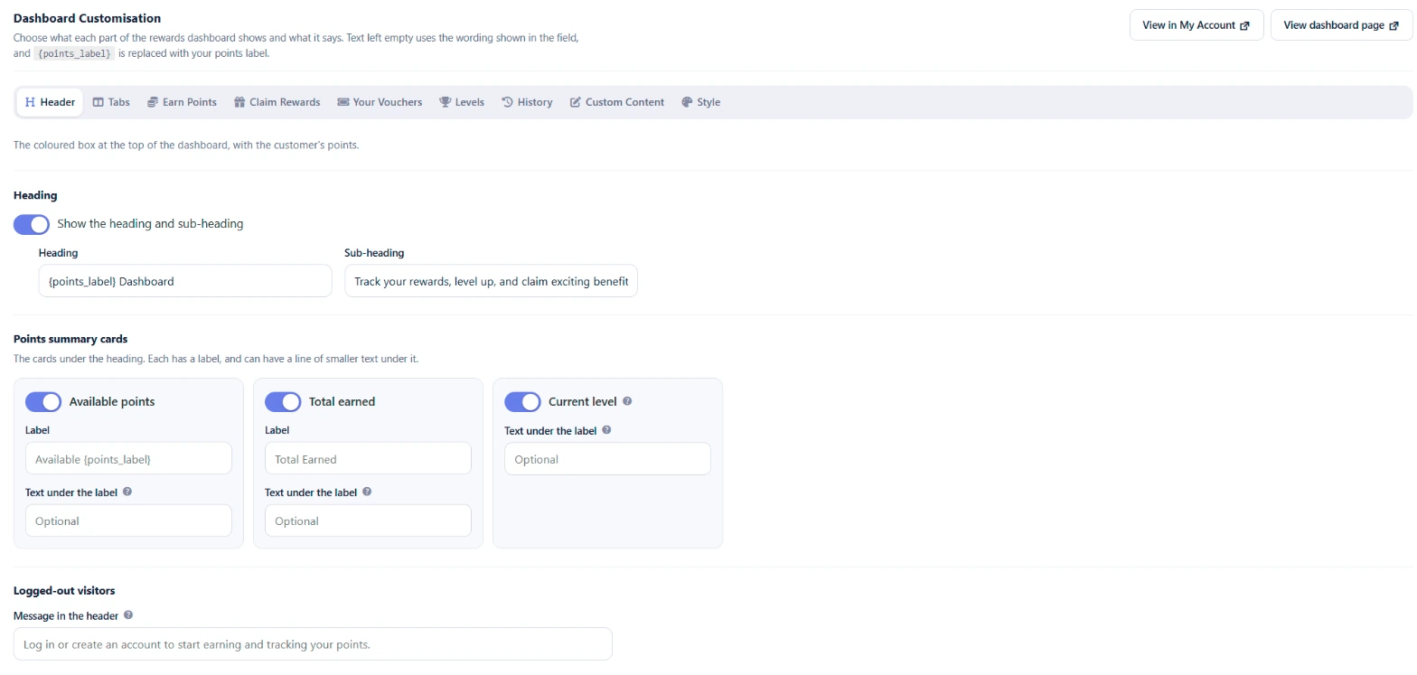
You can change what each part of the rewards dashboard shows and what it says under Points & Rewards › Settings › Rewards Dashboard › Dashboard Customisation. The section has a sub-tab for each part of the dashboard: Header, Tabs, Earn Points, Claim Rewards, Your Vouchers, Levels, History, Custom Content and Style. Use View in My Account or View dashboard page at the top to check the result.
Text fields left empty use the wording shown in the field, translated for you. {points_label} is replaced with your points label.
Header
The coloured box at the top of the dashboard.
- Show the heading and sub-heading, with your own Heading and Sub-heading.
- Points summary cards: switch Available points, Total earned and Current level on or off. You can change the label of the first two and add a line of smaller Text under the label to each card. The Current level card shows while levels are on, with the customer’s level as its label.
- Logged-out visitors: the Message in the header for visitors who are not logged in, when the dashboard is on a page of its own.
Tabs
Choose which tabs the dashboard shows, their order and their labels. Drag a tab by its handle to move it, use the switch to show or hide it, and type a new label in its field.
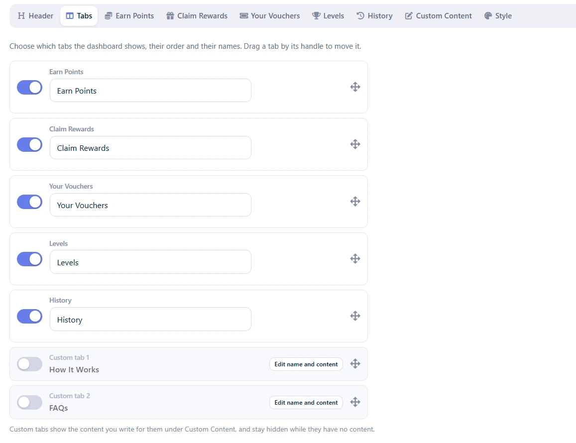
The list includes two custom tabs, How It Works and FAQs, which are off by default. Add their content under Custom Content, then switch them on here. See Add your own content and tabs to the rewards dashboard.
Open the dashboard on sets which tab opens first. If that tab is hidden or not available to a visitor, the first tab they can see opens instead.
Visitors who are not logged in see the tabs above except History and Your Vouchers, followed by a “Get Started” tab with the login and registration forms.
The content of each tab
The Earn Points, Claim Rewards, Your Vouchers, Levels and History sub-tabs control the headings, wording and parts of each dashboard tab. See Change what each rewards dashboard tab shows.
If a tab is hidden, its sub-tab says so and offers a Show this tab button.
Style
- Theme colours: Primary Theme Color (default #667eea), Secondary Theme Color (default #764ba2) and Accent Color (default #2ca58d) for buttons and highlights.
- Header background: Gradient from the primary to the secondary colour (the default) or Solid primary colour.
- Dark mode: Show a dark mode switch on the dashboard lets customers choose light or dark, and their browser remembers the choice. Once it is on, you can also choose Start in dark mode, Hide the switch, so the dashboard is always dark, and Make the header dark too.