





Change the wishlist colours and shapes
Simple WishlistsUpdated
The Wishlists › Settings › Styling tab sets the colours and shapes used by the heart button, the counter, the wishlist page and the My Account dashboard. Your theme’s own fonts are used everywhere.
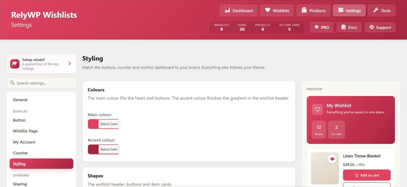
Set the colours
- Main colour: fills the heart and the buttons. Default:
#e0435f. - Accent colour: the second colour of the gradient in the wishlist header. Default:
#a8243f.
The setup wizard’s Look step also offers ready-made colour pairs (Rose, Ocean, Emerald, Violet, Gold and Charcoal) with a live preview.
Set the shapes
- Header style: Gradient (default) or Solid colour. This is the header at the top of the wishlist page and the My Account tab.
- Button shape: Rounded (default), Pill or Square.
- Card corner radius: the corner rounding of item cards, from 0 to 40 px. Default: 12 px.
Further changes with CSS
The colours are output as the CSS variables --swlp-primary and --swlp-secondary, and all plugin styles use classes that start with swlp-. You can add your own CSS in Appearance › Customize › Additional CSS or in your theme, for example:
/* CSS: make the wishlist button text bold */
.swlp-button {
	font-weight: 600;
}